
unfortunately this project is not supported on phone
please visit on a bigger screen
thank you
unfortunately this project is not supported on phone/tablet
please visit on a bigger screen
thank you
Optimizing Instagram Stories for Meaningful Views
Instagram Story
Design Challenge
Role: Product Designer, UX/UI Designer
Design Tools: Figma, Photoshop
Timeline: July - Aug 2024
Independent Case Study
Challenge Prompt
Understand why users don't enjoy Instagram stories anymore
Context and Background
When Instagram Stories were first introduced in 2016, many users were excited to view the temporary, in-the-moment content shared by their friends and mutuals. This new feature allowed for more spontaneous and authentic sharing, which was well-received by the community.
As Instagram starts growing as one of the biggest social media, many users start to become unsatisfied with the content people share on stories as it does not feel personalized, leading many users to be uninterested in even clicking on the shining red icon.
enjoy🍿
Final Protoype
Im glad you asked. Scroll down to view my process.
But…how did you get there?

Design Journey
My design journey is an crucial part of my identity as a designer. Each stage allows me to develop the most effective solution for any given challenge. In this case study, you’ll discover the why behind my design choices and how they led to my final deliverables.
Research and Insights
How I conducted expedited user research
Created and posted online surveys on social media
Interviewed friends and mutuals
Competitive analysis on how other apps implemented personalized features
Survey Results


4. What features would make instagram more enjoyable?

3. What type of content do you enjoy the most?
2. How often do you find stories from users you don't have a meaningful connection with?
1. How many stories do you view per session?

After reviewing the results of the survey and interviews I decided to sort and highlight the three key pain points to figure out what feature to implement.
Content Overload ( keypoint #1 )
users are annoyed by influencer-like spamming in stories
disinterest and frustration
Meaningful Connections ( keypoint #2 )
not close with most users on Instagram
prioritizing friends' and families' personal lives
Boredom and Overwhelm ( keypoint #3 )
users feel overwhelmed by irrelevant content, leading to boredom
users are uncomfortable with viewing exclusive personal content without a close relationship, contributing to the feeling of overwhelm and annoyance
Time for Competitive Analysis!
how other products implement personalization and meaning through stories
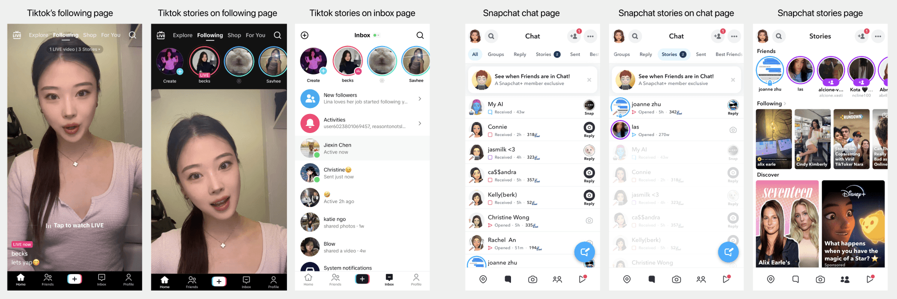
Tiktok Stories
hidden section in the following main feed
less focus on ephemeral content
stories can feel redundant due to overlapping with main feed content
Snapchat stories
need to go through friend request to view stories
high level of privacy
discover stories are tailored based on user interests, offering a mix of personalized content
The algorithm may push irrelevant content; heavy focus on branded stories can detract from user experience
After analyzing how other products personalization feature,
I aim to incorporate simple features that can be seamlessly integrated into Instagram's layout


Relevance
ensure users to prioritize and view stories that are more likely to be relevant and meaningful, enhancing engagement
Content filtering
streamlines the story viewing experience by focusing on content from people the user is genuinely interested in.
User control
allows user to have more control over the content they see, allowing them to opt out of stories they find irrelevant or uncomfortable
Instagram already existing functions that implement personalization
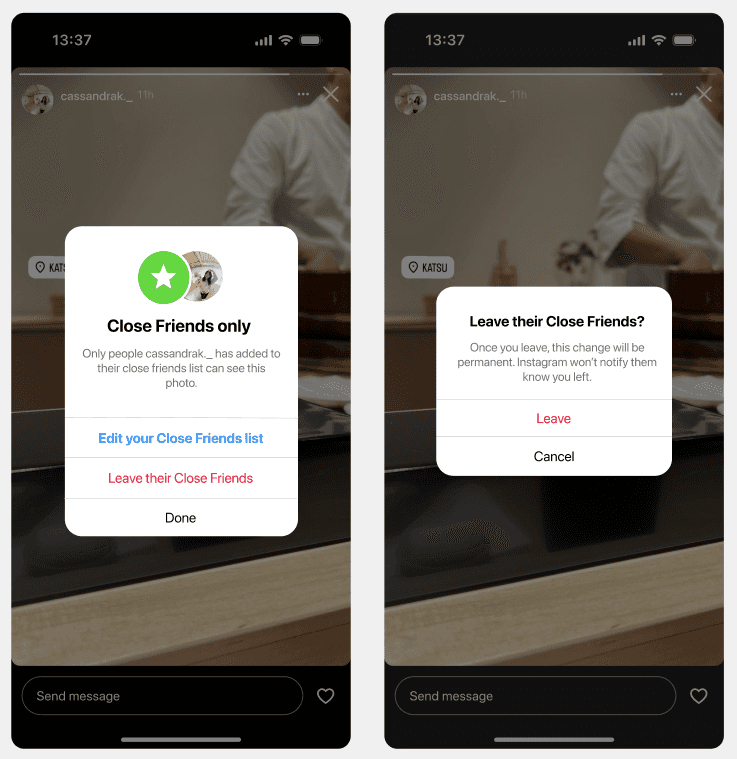
Close friend's story
Privacy: users get to share more personal or sensitive content with a selected group of trusted individual
Relevance: close Friends are more likely to be interested in and engage with certain content, making interactions more meaningful.
Exclusive update: to provide exclusive updates or behind-the-scenes glimpses that they don't want to share with their entire follower base.
Enhanced engagement : Close Friends lists can foster closer connections and more engaged interactions with select followers.
Mute Story
Irrelevance: users find the content shared by certain mutuals uninteresting or irrelevant to their interests.
Content overload: to reduce the volume of Stories they need to sift through, especially from users who post excessively.
Avoiding annoyance: some mutuals may spam Stories with repetitive or promotional content, leading users to mute them to avoid annoyance.
Focus on close connection: users prefer to see updates from close friends or more meaningful connections.
Favorites Post Feed
Separate Page: users can access a dedicated page in the feed where posts from their "Favorite" accounts are collected, creating a focused space for important content.
Prioritized Viewing: This separate page allows users to easily keep up with posts from close friends, family, or favorite creators without them being lost in the general feed.
Personalization: Offers a personalized experience by isolating content from selected accounts, ensuring users never miss important updates.
Close Friend Post
Personalization: Users can share posts specifically with their Close Friends list, allowing for more targeted and relevant content sharing.
Selective Sharing: This feature enables users to differentiate between content they want to share with everyone versus a smaller, more trusted group.
Enhanced Privacy: Provides a layer of privacy and intimacy, as users can choose to share more personal or sensitive posts with only their Close Friends.
After analyzing the different existing functions on instagram,
I realized these features were too black and white, where there was no other option for a middle ground.
👩🏻🎨
Time to Design
screens | user interface

feature 01 | Mute main story
Enhancing digital experience through seamless content muting
Enables users to mute someone's main stories without unfollowing them.
Provides a personalized content management option while preserving social connections.
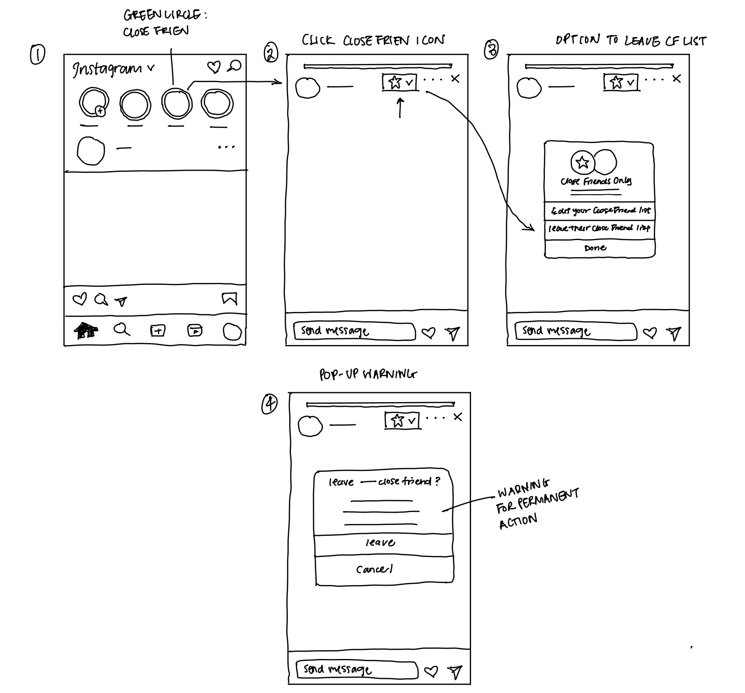
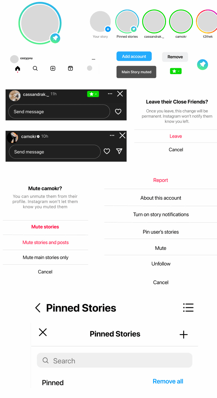
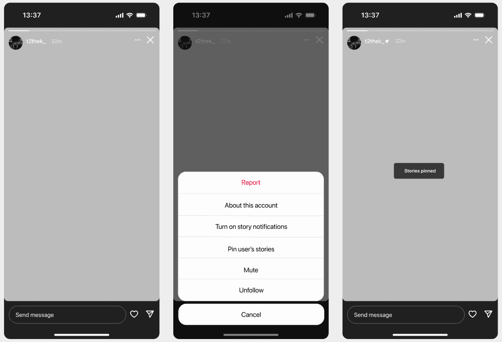
feature 02 | Leave close friends stories
A feature that empowers user to maintain control over their connections
Allows users to opt-out of being included in someone's Close Friends list.
Enhances user control over the content they see without needing to unfollow or block the person.
While exploring existing Instagram features, I decided to come up with a feature similar to Close Friends Post and Favorite Post Feed for Instagram Stories, using a de-cluttered layout that tackles the less focused structure currently in place.
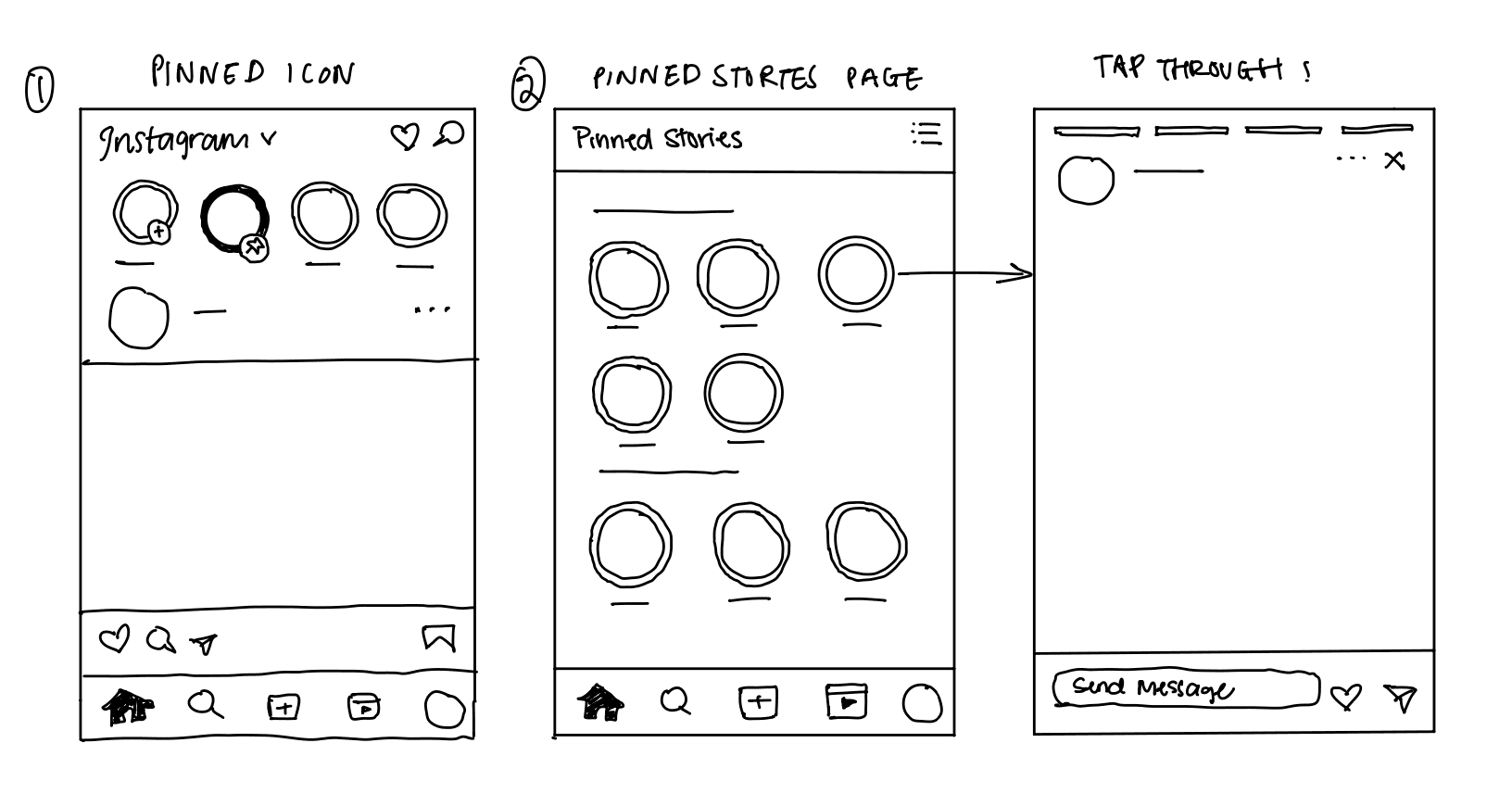
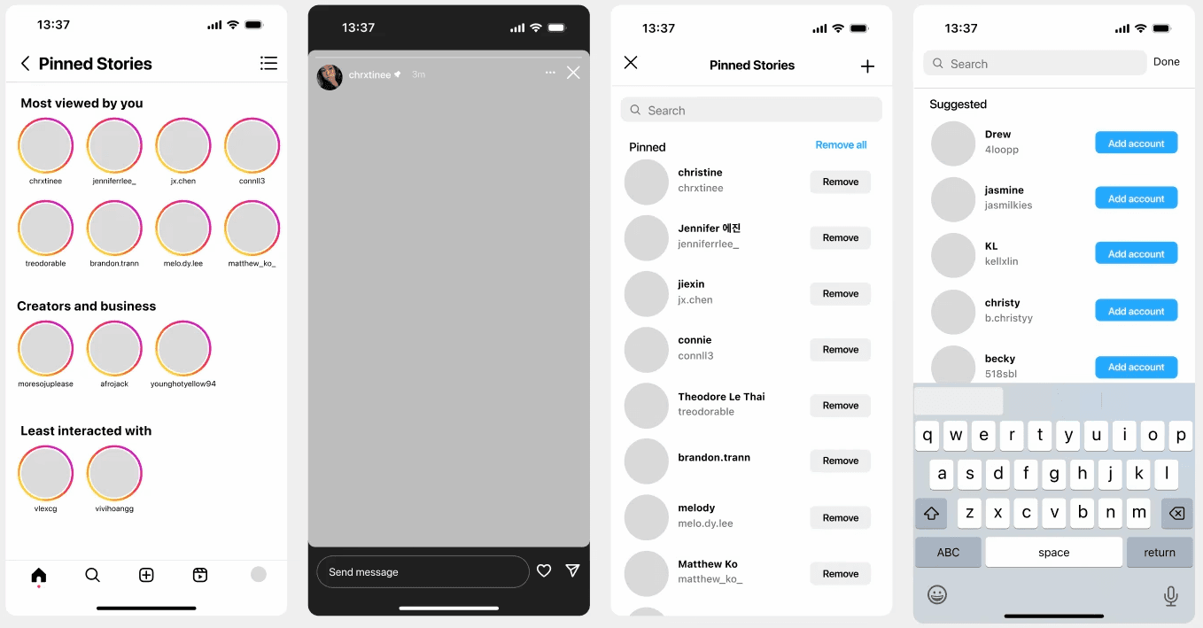
feature 03 | Pinned story page
Dedicated space for keeping your favorite moments easily accessible
Introduces a dedicated page for viewing stories from pinned users.
Accessed via an icon beside the user's own story icon, it offers a quick and easy way to engage with favorite or important content.
This feature is high feasibility as it is build upon instagram’s existing feed page for “favorites” and close friend stories. It is also high impact as it offers a strong social aspect to stories, encouraging users to engage more with personalized stories, and de-clutters the story layout.

Encouraging Meaningful Views for All Users
After analyzing key findings, I decided to pursue the all three features as each serves purpose for specific user needs, providing a more versatile, user-friendly experience.
Maximizing Consistency with Instagram's UI
After analyzing Instagram's existing features and icons, I designed a UI kit for my feature that emphasized maintaining consistency with the app’s interface while ensuring each element was clear and intuitive for users.
While designing the UI, instead of using the sliding notifications from my initial design drafts for the pinned page, I chose to implement the original pop-up notification used for muting stories. It’s simpler and less overwhelming for users while staying consistent with Instagram’s existing UI.


Mid- Fidelity Screens
Optimizing Story Organization
In designing the Pinned Stories Page, I initially considered categorizing stories into Close Friends and Regular Stories. However, since color coding can effectively differentiate Close Friends, I shifted to a more versatile approach where I took inspiration from the existing categories for the following page.
Categories for pinned stories page: Most viewed by you, Creators and business, and Least interacted with.
I decided to add the "Least interacted with" category within the pinned page to help users gain more insight into which accounts they engage with the least, allowing them to manage their story interactions more effectively.
Evaluate Feedback 💬 + Iteration ✍🏻
I conducted a round of user testing with 5 users to receive feedback from my design and discovered the following points:
Users enjoy having the option to control what content they want to see
Users liked the different entry points to access the pinned page
The feedback validated the effectiveness of my feature in addressing the user problem, giving me greater confidence to move forward with the design process. Additionally, I implemented the following adjustments to further improve the overall experience and interaction of the feature.
Ensuring Clarity
Since the option to leave close friend is a permanent change, I decided to add a extra pop-up notification that explains their decision to leave is permanent to prevent mistakes like mis-clicking.
As shown on the right, I added a brief explanation that clarifies this action is a permanent change and it cannot be undone.
Final Interactions of the Features


Leave close friends
Mute main story
Pinned Stories
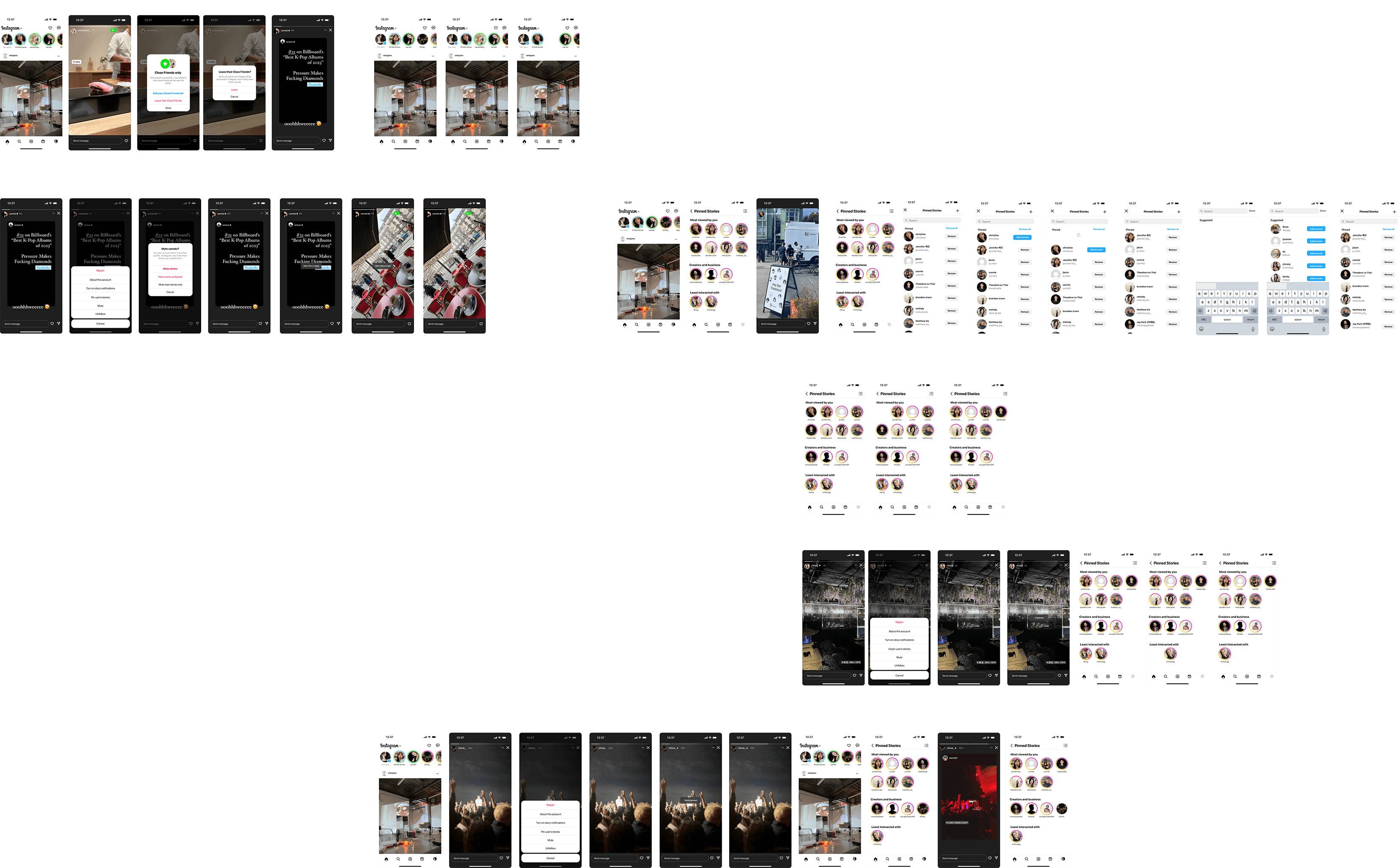
All screens
46 screens in one week
Reflection✨
What I learned
This is my first ever case study and I've definitely learned a lot throughout this process. My key takeaway is that design is never truly finished; there’s always room to go back, refine, and improve. Iterating is key to ensuring the design evolves in the right direction based on feedback and deeper analysis.
Looking back, I wish I had more time to fully apply this approach in my case study. I would have been able to further refine certain aspects, address feedback more thoroughly, and explore even better solutions.
Looking forward
Reflecting on my first UX/UI case study, I realize just how challenging yet rewarding this journey has been. As someone who had no prior experience with design tools like Figma or Photoshop, every step felt like a steep learning curve. From mastering the basics of these powerful tools to translating abstract ideas into visual solutions, the process pushed me far outside my comfort zone. I discovered a deep passion for UX/UI that I never anticipated.
I am beyond grateful to have stumbled upon this field. This case study is just the beginning, and I will continue learning and contribute to users with the skills I am building.
🙏🏼
Thank you for your time!